CUTCODEDOWN
Minimalist Semantic Markup

Welcome Guest
Please Login or Register

If you have registered but not recieved your activation e-mail in a reasonable amount of time, or have issues with using the registration form, please use our Contact Form for assistance. Include both your username and the e-mail you tried to register with.

Author Topic: Astigmata, my "accessible" monospace font.  (Read 388 times)

Jason Knight

  • Administrator
  • Hero Member
  • *****
  • Posts: 1060
  • Karma: +188/-1
    • CutCodeDown -- Minimalist Semantic Markup
Astigmata, my "accessible" monospace font.
« on: 17 Dec 2023, 02:55:21 am »
As programmers we deal with monospace fonts a good deal, and to be frank most of them aren't very good. That's not so much the failure of the fontographer, as it is that latin characters are not designed to BE monospaced. The letters i, j, l, and t in their lowercase forms are simply not well suited to it.

I have recently (past year) developed a very bad astigmatism. Bright lights at night, bright themes, and even some fonts with "thin glyphs" all cause problems for me. To the point I was having trouble reading my own code.

I mean we all know courier is trash which is why nobody uses it, but when I'm having issues reading Fira Code or Hack, I had to do something about it.

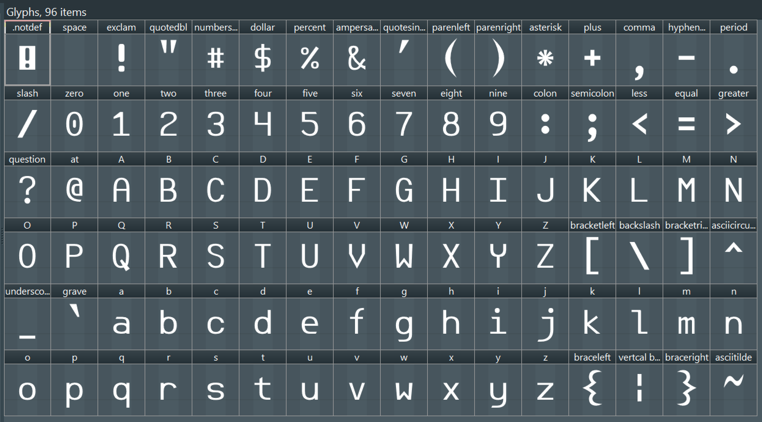
Note that this font is written to fit MY issues and limitations and is based on what my eyes see (or don't see). I have no clue if it will be useful or legible to others even though I followed "best practices". From increasing bowl sizes 30 units (out of a 1440 x-height), to a 3:2 bar to slab ratio, to a 120 unit leading/trailing space.

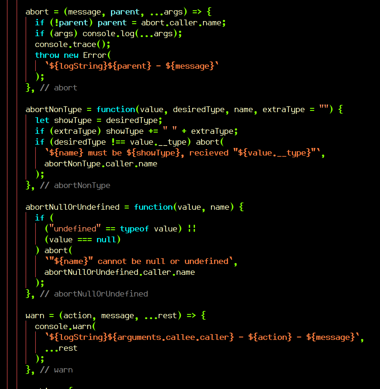
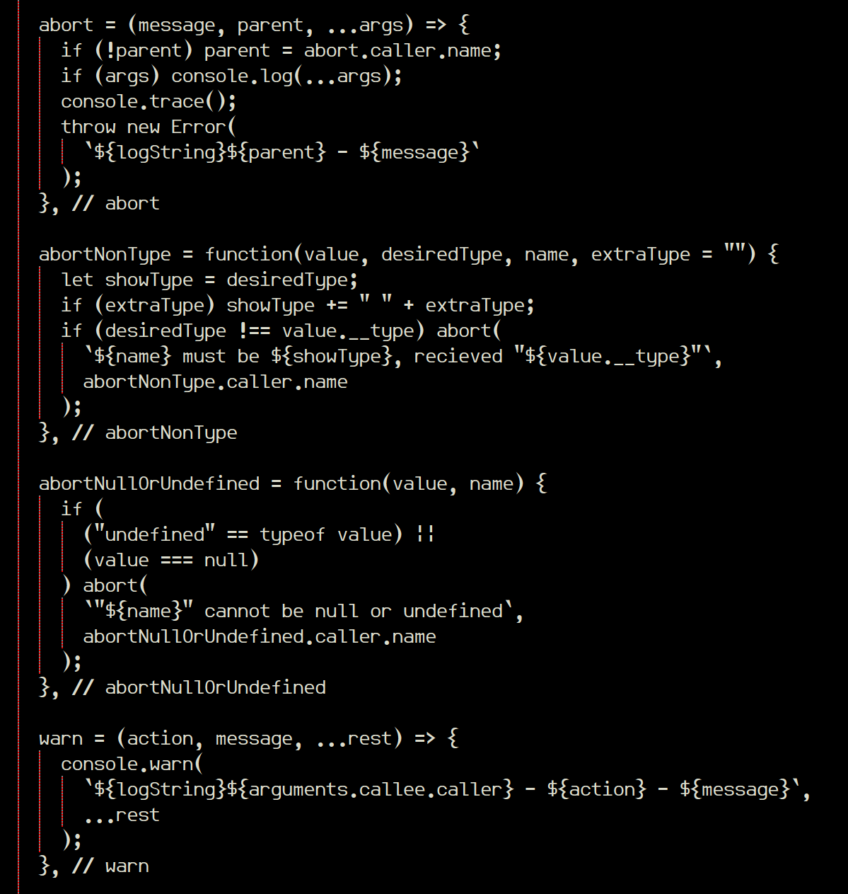
Here's some pics of it in use.


For now I've only completed support for the 96 base ASCII characters, which in 99% of my work is all I need.


That said If people like it (maybe drop some $$$ into my PP donation box?") I might be prompted to finish out at least Latin-1.

Get it here. Includes TTF for native install, and woff/woff2 for use on websites.
https://deathshadow.com/downloads/Astigmata-Regular.rar
We are all, we are all, we are all FRIENDS! For today we're all brothers, tonight we're all friends. Our moment of peace in a war that never ends.

durangod

  • Sr. Member
  • ****
  • Posts: 415
  • Karma: +5/-0
  • Weebles Wobble - but they dont fall down!
Re: Astigmata, my "accessible" monospace font.
« Reply #1 on: 17 Dec 2023, 03:38:00 am »
I currently use something similar in my code editor.  Well its black background and colored text.  But i find what you did very clear to read, it sort of pops in a good way that mine on my editor does not.   

We also all know that you always follow best practices and so that is a given :)

Jason Knight

  • Administrator
  • Hero Member
  • *****
  • Posts: 1060
  • Karma: +188/-1
    • CutCodeDown -- Minimalist Semantic Markup
Re: Astigmata, my "accessible" monospace font.
« Reply #2 on: 17 Dec 2023, 02:38:21 pm »
You folks would not believe the amount of work that went into the lower-case j, i and t in terms of micro-managing how they interact with other characters.
« Last Edit: 17 Dec 2023, 02:40:04 pm by Jason Knight »
We are all, we are all, we are all FRIENDS! For today we're all brothers, tonight we're all friends. Our moment of peace in a war that never ends.

durangod

  • Sr. Member
  • ****
  • Posts: 415
  • Karma: +5/-0
  • Weebles Wobble - but they dont fall down!
Re: Astigmata, my "accessible" monospace font.
« Reply #3 on: 17 Dec 2023, 06:37:21 pm »
You folks would not believe the amount of work that went into the lower-case j, i and t in terms of micro-managing how they interact with other characters.

I dont doubt it one bit.  Those of us that have worked with creating logo's and banners (i use a very old version of photoshop v10) know the struggle sometimes with tight spaces. Some letters just wont fit and others like j, i, t, and even some special characters change the look of the logo significantly.  Some of them look like they are not even the same font size or style either too large or too small.  Several times i had to sort of cheat and make the one letter a half font size larger so it would look the same. 

I dont know how to you do what you do, i dont know if there is a point in time and your experience that computer heaven opens up and you enter a world of total knowledge like a zen.  But that is why i was suggesting you write some kind of "pages between covers" to leave behind when your gone man..  :)  Not that its gonna happen any time soon i hope..  :)


SMF spam blocked by CleanTalk

Advertisement